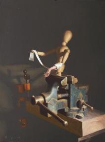
The piece would be much stronger if the background had certain areas that were cooled down, which would enable the form to resonnate more to warm/cool color interaction.
Do you have a suggestion about what type of color or value would appear cooler. This is something I've also been thinking about for three or four years. Backgrounds... I've spoke with several artists I know about them, and I'm interested in your thoughts/ideas. Dustin
Hello Dustin, Just found your site. Your a very talented painter.
I have a blog as well if your interested, http://jeffreyfreedner.blogspot.com
Anyway I agree about the background. There are some who use blue a lot to create the feeling of space moving away, blueish grays.
I think one should also look to painters such a Pieter Claesz, who was a master still life painter and its also interesting to study as his paintings are full of meanings and quotes from biblical text, they would be obvious to his contemporaries, but to us not so much.
Of course Chardin, who is to me one of the greatist master of the still life.
To purchase a painting you can either use the Buy Now button located by the painting of your choice, or you can click on the title of the painting and send me an email saying you wish to purchase it. The price listed is all inclusive.
Recent Events
"Inchoate", one of my larger works was selected for the 2006 International ARC Salon.


3 comments:
The piece would be much stronger if the background had certain areas that were cooled down, which would enable the form to resonnate more to warm/cool color interaction.
Do you have a suggestion about what type of color or value would appear cooler. This is something I've also been thinking about for three or four years. Backgrounds... I've spoke with several artists I know about them, and I'm interested in your thoughts/ideas. Dustin
Hello Dustin,
Just found your site. Your a very talented painter.
I have a blog as well if your interested, http://jeffreyfreedner.blogspot.com
Anyway I agree about the background.
There are some who use blue a lot to create the feeling of space moving away, blueish grays.
I think one should also look to painters such a Pieter Claesz, who was a master still life painter and its also interesting to study as his paintings are full of meanings and quotes from biblical text, they would be obvious to his contemporaries, but to us not so much.
Of course Chardin, who is to me one of the greatist master of the still life.
Post a Comment